


lightspeed champion

Hover over the thumbnail for a full-size version.
| Author | astheoceansblue |
|---|---|
| Tags | author:astheoceansblue greeneggsandham unrated |
| Created | 2009-11-25 |
| Last Modified | 2009-11-25 |
| Map Data | |
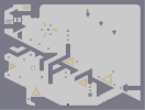
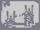
| Description | A purely aesthetic rework of GEaH's galaxy of the lost [nmaps.net]
I thought the original was absolutely lacking in atmosphere, and as a result my experience of the excellent gameplay was diluted. I've attempted to bolster the gameplay with some of my own ideas about atmosphere and aesthetic appeal. I think this is much better, let's see who agrees. I know I've left myself open for MUCH critical pain with my comments here and on that map, but what the hell... ...bring it on, I say! :p |
Other maps by this author
 |
 |
 |
 |
 |
 |
| Try Angles (sans Rocket; avec Gauss) | Battle Station, Oro! | Reactor Core | Underneath the sink | Praise us, oh you'll raise us! | The Temple Trap |
Comments
Pages: (0)

2009-11-26
agree's
atobs is better, more atmosphere.


2009-11-25
ARGH!!!
I'm far too easy! :p

2009-11-25
actually,
I haven't played either, I was just giving you shit. ;)
2009-11-25
No.
I mean atmosphere.
Surely you can see how in this version it feels like you're exploring a structure more than it does in the original?
The original has too much open space, and there's no real sense of solidity to the structures, hence the lack of atmosphere.
Any decent author could take the original and define it more and the atmosphere would increase. Some would do it better than others, of course, but the point remains.
2009-11-25
by atmosphere you mean...
atob aesthetics.

2009-11-25
Agree with SkyPanda.
And this -is- prettier, but I'm not sure how much of a difference that makes in this case.
2009-11-25
Not really a fan of the
3/7 tiles or the extra little spaces. I guess I'm just a GreenEggs type of person.

2009-11-25
This is nice.
The flow coming from the launchpad feels better as well. Hmmmm, maybe you were right......again.
: )
: )
2009-11-25
They're in my deleted archives.
Somewhere on the old forums.
I'll link them up on my profile later on.
I'll link them up on my profile later on.

2009-11-25
Or just opinion
others may think your edit has more.

I guess it comes with time.
2009-11-25
Oooh
Top right...
I think I prefer it before ONLY because that dark space adds a little more atmosphere.
I think I prefer it before ONLY because that dark space adds a little more atmosphere.
2009-11-25
Aldaric
I can't see what you changed in that edit. Did you post the wrong one or am I being inept?
2009-11-25
I did refine them at one point.
But they weren't received very well. I guess because they're so well known people don't like having them messed with.
kind of like if Maxmio revised Mount Doom to meet today's standards, I'm not sure it would work...
kind of like if Maxmio revised Mount Doom to meet today's standards, I'm not sure it would work...
2009-11-25
Original was pretty
This is pretty too.
It would be cool if you were to remix the look of some of your classics, like impulsioN and Sleepy Hollow.
It would be cool if you were to remix the look of some of your classics, like impulsioN and Sleepy Hollow.
2009-11-25
You probably won't like this, but whatever
bring it on :p
http://pastebin.com/me3d80d7
http://pastebin.com/me3d80d7
which makes me think about those terrible movies. So really that negated any good feeling toward this map.
2009-11-25
I blew up into a million parts
when I hit the launch pad. :(
| Demo Data |
|---|
Ferox
Atmospherically