Zephyrean Mine
Hover over the thumbnail for a full-size version.
| Author | jslimb |
|---|---|
| Tags | author:jslimb image-map imagemap nreality rated |
| Created | 2010-05-31 |
| Last Modified | 2014-02-06 |
| Rating |
4 by 20 people.
|
| Map Data | |
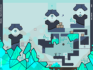
| Description | At the Zephyrean Mine, you can travel there and watch all those huge gemstones.

This map is an image-map, and nreality is nessesary. Wow... two good imagemaps in a row... Since the former background url is broken, please replace it to a new one. http://img408.imageshack.us/img408/3476/zephyreanback.png ↓ http://imageshack.com/a/img849/639/4avn.png |
Other maps by this author
Comments
Pages: (0)
2010-09-30
I love the door
2010-06-21
4.
2010-06-01
You just got ATOB'd
;)
2010-06-01
This is cool
I really like the arrows and the exclamation point. I wish those orange mines were flashing like in your other map. atob's pointers are good; consistency between fine and thick image lining would make this much better.
@Aphex: Hoth
@Aphex: Hoth
2010-05-31
fantastic image
I like the relaxed athmosphere in this map. Excellent tileset, too, and I can't say something bad about the gameplay.
Another special thing that I like in this map is that it has a kind of a story. That makes it more interesting and entertainig.
Definitely a 5aved.
Another special thing that I like in this map is that it has a kind of a story. That makes it more interesting and entertainig.
Definitely a 5aved.
2010-05-31
My opinion
First i want to see that without all the effect and the image this map is 4/5 for me because there's some fun ideas with drones and the tileset is excellent. People who critic image-map sometimes forgot to rate the level itself ;)
And after i'm forced to agree with Atob over his post wich show the defaults of your image, so i rate the image 4/5, too. There's some very fun things in your image but not perfect...
And finaly I don't rate this level 4/5 but 4.5/5, because the fusion of a nice level and a nice image make a very nice atmoshere. Improve that for have a 5/5 of everyone ! ;)
Sorry for my bad english and i understand that some people don't agree with me, i just want to comment my rate.
2010-05-31
I like:
1) The fact that the image has a story. It feels amazing to jump around a futuristic mining planet (reminds me of that snow planet place in star wars... y'know... yeah)
2) The fact the gameplay has not been neglected. The map is still fun when the image is taken away; yet the image is not unecessary, it really does add to the gameplay.
If you tweaked the image as atob said, this would be feature worthy.
2) The fact the gameplay has not been neglected. The map is still fun when the image is taken away; yet the image is not unecessary, it really does add to the gameplay.
If you tweaked the image as atob said, this would be feature worthy.
2010-05-31
Hmm.
It plays good, but the image has some shortcomings - 100% agree with atob. The colors are cool, these give the map some cold feeling - it's nice. Uh... 3.5, rounded up.
2010-05-31
(continued)
I know this may seem like nitpicking, but these little errors are spread out all over your image maps. I know it takes a long time to produce these, and going through with a fine-tooth comb can be very arduous, but it's really worth it when the end product has that little extra sheen.
This map is far from perfect in an artistic sense, and that sense /is/ important. No matter how many people rate this 5/5 and tell you how fabulous it is, it could be /so/ much more effective if you put that little bit of extra effort in.
Check out my immage map here for an example (sorry to use my own, it's just easier than searching through my favourites for another): http://www.nmaps.net/196959 [nmaps.net]
Now, I know this isn't perfect either, but the consistency of work is definitely a lot higher. I spent a good deal of time making sure the lines were as neat and even as possible, and made sure every area was covered. I also used stand out colours to give the maps even palate a little bit of separation so it wasn't swamped in dull greys and browns.
I'm sure you'll agree that the extra time spent gives it a much more effective atmosphere. Your image maps have a lot of potential and are, at their foundation, some of the best I've seen (especially the little flourishes you add).
If you cleaned them up a bit they'd be so much better.
2010-05-31
Ok, here's some specific feedback.

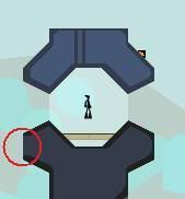
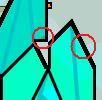
In the red circle, you've missed out line completely. Line work in these types of maps is really important. If you don't keep the thickness consistent you end up with a very sloppy looking final piece.

The circle on the left shows an area of grey tile exposed.
The circle on the right shows a heavily pixelated diagonal line (this is actually quite hard to prevent, and it's not something I've managed myself. I'm pretty sure that's my lack of ability talking too, however).
Both of these give the map a rushed an uneven aesthetic feel.

An overlapping line in the bottom circle with three lines of different thickness.
The shade in the top circle is also sloppy, it leaves a little area exposed on the left (which makes it look slapdash) and the divide is uneven in colour.

You use too many of the same types of colour. I get what you're going for, but the same Arctic feel could be produced without using such a bland and repetitive pallet. The exclamation mark, for example, could be a shade of red. This would stand out from the map and really accentuate the point of it.
2010-05-31
I 100% agree with ATOB. :/
Another imagemap, overrated. :/
2010-05-31
you're amazing.
oh my god.
2010-05-31
nreality agd
loved it. a really cool immersive experience. 5aved. I respectfully disagree with atob's comment. Sure - it takes some getting used to, but the overall effect was fun and mesmerizing.
| Demo Data |
|---|
2010-05-31
Hmm.
I'm sorry to be "that" guy, but this map is above average at best.
The image work is sloppy, the lines are uneven and pixelated and the colours are bland and make the map seem cold (not in the atmospheric way you intended).
I really like all the little touches you added, and the concept of this is good, but you really do need to put more effort into your actual image quality.
People simply telling you this is fantastic is not going to help you improve. I'd try your best to take those types of responses with a grain of salt.
2010-05-31
interesting
good image, but it could be sort of confusing at times though, and the gameplay could be improved with some kind of active enemy other than the chaingun and the drones.
| Demo Data |
|---|
2010-05-31
4.5aved
The image and the resulting atmosphere is delightful. The gameplay was mostly pretty good as well, but there were a couple of mines I didn't like, as with ChrisE, especially the top right one.
2010-05-31
the enticing imagery alone is spectacular.
*plays map*
2010-05-31
This is awesome
another corker image map from you, jslimb. This is pretty fantastic. The functions are sweet, how everything worked was real nice, and I found the fact that the other ninjas work night and day mining this new type of precious mineral, only to have it all stolen by your ninja. Epic :3
To all the other mappers reading this: I'm a sucker for image maps. If I see one I love; like this, I 5aved it. So deal with it.
To all the other mappers reading this: I'm a sucker for image maps. If I see one I love; like this, I 5aved it. So deal with it.
2010-05-31
I wish AGD was possible...
but this image is fantastic. I'd question some of the mine placements, but a pretty good job overall.
4.
4.


GokuDB