

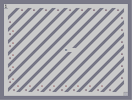
BP7
Hover over the thumbnail for a full-size version.
| Author | warrioronthesky |
|---|---|
| Tags | action author:warrioronthesky fun mines n-art tileset unrated |
| Created | 2010-09-17 |
| Last Modified | 2010-09-17 |
| Rating | 5 more votes required for a rating. |
| Map Data | |
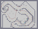
| Description | 7th part! Enjoy! |
Other maps by this author
 |
 |
 |
 |
 |
 |
| Flowers | BP1 | BP2 | Chest | BP5 | BP6 |
Comments
Pages: (0)

2010-09-17
-.-
| Demo Data |
|---|

2010-09-17
for the sake of
an example.

2010-09-17
Why did you rebuil his map?
It was very messy but more fun to play than your remake...

2010-09-17
Hey!
Thank you for tips.
I will keep mapping,for sure!!!
I will keep mapping,for sure!!!
(continued, read the lower one first)
And those were the changes.
And here are some don'ts for your map:
- Try not to z snap. It looks messy, because it's hard to get the positioning of the mines perfectly.
- That being said, mines are like gold. Too many make a map look as if you overstuffed it with gold.
- Try not to leave open corridors. What I mean by that is, if you take a look a the upper right of your map (and my edited one), you will notice that there is no challenge, action, risk, or anything there. It's just, a path. Try to really avoid those.
- The paths! Really, I think it'd be great if you didn't concentrate so much on creating a path for the player, than letting the player choose their path.
Oh, and just a reminder, not all maps need locked doors.
Finally, You're getting insanely better. and try to limit your map output. while it's good and all that you're practicing alot, really, the good maps come from spending lots of time and thought on them, asking yourself whether they look good, and are fun to play.
Keep on mapping. :D
2010-09-17
READY FOR SOME MORE? :D
I really don't know why, but this feels so fulfilling when I comment like this.
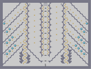
the tileset.
In general, it just looks too broken up to be good.
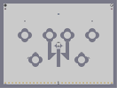
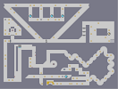
And to show you a little example, heres something quick i threw together.
Quick map [pastebin.com]
Hey, doesn't that look really familiar? Sorry, but I took your map and just played around with it a little.
First off, I took out most of the mines. That many mines just looks insanely cluttered, and weird.
Second, the tileset looks alot cleaner. It's incredibly simple too if you look at it. Simple, and clean, yet it works.
Third, i changed the gold placement. This is what i mean by "organized". If you look at the gold it looks fairly uniform, and it's sorta well spread out through the map. Theres only about 40 pieces, so it fits the map length well.
If you notices, I also expanded on the bounce block theme you had going on, and added in mines to complement the theme. I also added a couple more gausses.
I also eliminated the unnecessary climb from the beginning. Really, it had no purpose whatsoever.
The doors near the exit changed up a bit, as I moved the door key locations. I did so to create something called optional gold. The area with the drones is a complete optional risk, if the player's willing to risk him/herself over those gold pieces waiting there.
finally, I removed the lower barrier to create an open room, that could be worked with using another gauss, and the bounceblock theme.
the tileset.
In general, it just looks too broken up to be good.
And to show you a little example, heres something quick i threw together.
Quick map [pastebin.com]
Hey, doesn't that look really familiar? Sorry, but I took your map and just played around with it a little.
First off, I took out most of the mines. That many mines just looks insanely cluttered, and weird.
Second, the tileset looks alot cleaner. It's incredibly simple too if you look at it. Simple, and clean, yet it works.
Third, i changed the gold placement. This is what i mean by "organized". If you look at the gold it looks fairly uniform, and it's sorta well spread out through the map. Theres only about 40 pieces, so it fits the map length well.
If you notices, I also expanded on the bounce block theme you had going on, and added in mines to complement the theme. I also added a couple more gausses.
I also eliminated the unnecessary climb from the beginning. Really, it had no purpose whatsoever.
The doors near the exit changed up a bit, as I moved the door key locations. I did so to create something called optional gold. The area with the drones is a complete optional risk, if the player's willing to risk him/herself over those gold pieces waiting there.
finally, I removed the lower barrier to create an open room, that could be worked with using another gauss, and the bounceblock theme.
_destiny^-
Try to work on your aesthetics