


some ideas for Nitrate
Hover over the thumbnail for a full-size version.
| Author | nemetacyst |
|---|---|
| Tags | author:nemetacyst unrated |
| Created | 2007-10-06 |
| Map Data | |
| Description | you dont even need to bother looking at this, it is not my work overall, not my idea, and i want zero credit |
Other maps by this author
 |
 |
 |
 |
 |
 |
| Pipe Movement 2.0 | Don't Panic | Necron Haze | Millipede | Questionable Return | Amoebas Evolved - Spiky Blobs |
Comments
Pages: (0)

2007-10-06
still looks cool

2007-10-06
nah
i give up. it's the end of my holidays i'll have hardly any time to finish it. anyone else can if they want.
im gunna keep it to maybe do later, but not now.
im gunna keep it to maybe do later, but not now.
2007-10-06
seeyas all next week!
goodbye.

2007-10-06
hahaha
have fun
i have a book on python scripting.
2007-10-06
nah i use action script.
and splitting text is (censored) hard. i dunno how raigan and mare did it.
2007-10-06
oh
so this is a continuous thing your doing...
huh...i havnt done much programming but if you can create code, i dont see why going the other way would be too hard
ah well, good luck, i look forward to seeing it
huh...i havnt done much programming but if you can create code, i dont see why going the other way would be too hard
ah well, good luck, i look forward to seeing it
2007-10-06
so i'll have to go back
cause my computer dies after about 800 objects in N.
2007-10-06
one other thing.
i made my own editor. very much like ned. but able to handle way more objects, so i'm lag free.
just. i haven't been able to make it load maps, so i can't really delete objects that easy.
just. i haven't been able to make it load maps, so i can't really delete objects that easy.
2007-10-06
great
im sorry if this sounds really critical, too
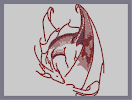
the outline is really good, very few flaws (i highly suggest you fix the neck line that goes into the body though, that one didnt seem to look right to me)
ha, critical again, sorry
the fact all i need to talk about is shading and not crappy drawing or just utter failing at art is really good
youre doing well, really, im just trying to help get some details across because they took me a long time to get, and in some cases never really did get down
2007-10-06
you dont have to start over
i used an old version so i didnt have to lag my computer
you can probably thicken your lines and add the rocket shading without going back, though there will be areas of less shading and therefor deleting the mass of mines (having white space is good, it can make it look shiny, and also adds a more forward dimension contrasting the shdings negative dimension)
you can probably thicken your lines and add the rocket shading without going back, though there will be areas of less shading and therefor deleting the mass of mines (having white space is good, it can make it look shiny, and also adds a more forward dimension contrasting the shdings negative dimension)
2007-10-06
so, basically
you want me to go way back, near the start and change all my lines and shading?
2007-10-06
yes
it is hard and takes a TON of time
(and i advise against swearing much on numa, 's family friendly!) lol, but yea, its just not necessary, lets keep the bad habits from the children, folks
ha...
(and i advise against swearing much on numa, 's family friendly!) lol, but yea, its just not necessary, lets keep the bad habits from the children, folks
ha...
2007-10-06
here
is the original
http://numa.notdot.net/map/104514
http://numa.notdot.net/map/104514
2007-10-06
okay...
relying on lines is bad
so by increasing the lines width and shading it by the c snap and with rockets, there is no loner a line, it is now just a shaded region which conveys some depth
now, im not great at it, i ahvnt done it in a long time either, but it gets hte idea across...
as for thw wings, well, i didnt do much different and i only did that in order to contrast with the arm part of the wing...
the thing is, you did a very good job with the arm part on your latest one (i used an older sketch obviously) and using blank space as you have is good, its another way to define depth without lines and the unlooker assuming it
and i just thought the patchy idea looked kinda cool on the wings...what still needs to change on them, though, is the lines...
in short, AVOID LINES if you can and SHADE carefully with respect to 3d space and shadows(like the darker part of the wing partly behind the large portion)
thats about all i got, its a good idea and overall the lining was very good (although i did alter it in a few places you may want to look at)
also remember when using a picture, that ned physically (okay, digitally) CANNOT do everything, and therefore you just chose spots to change to keep it looking awesome


2007-10-06
i like this way much better~!
emphasis on the ~
2007-10-06
can u leave it here for a little while?
thanks.
mr__littlelvl
WOW
so awesome.