


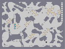
Obliterated
Hover over the thumbnail for a full-size version.
| Author | Riobe |
|---|---|
| Tags | author:riobe fun medium playable race rated speed |
| Created | 2008-08-21 |
| Last Modified | 2008-08-21 |
| Rating |
4 by 18 people.
|
| Map Data | |
| Description | Traditional race. Enjoy.
Slight edit. DED to SkyRay and altemo. Whoops, inspired by this [nmaps.net] |
Other maps by this author
 |
 |
 |
 |
 |
|
| Yoshi V1 | Flight 701-N | Yoshi V2 | The Alleyways Of London Ruptured | As Life Fades Away... | Take Cover |
Comments
Pages: (0)

2008-09-11
Wow..
This deserves to be featured, truely. This is probably one of the best races i've found in a while. Abousolutely flawless flow and mine placement and also the gameplay is incredibly smooth. 5/5 Genious.


2008-08-25
ahh,
whatever. i'll just wait till your next race, and then comment extensively on that one.

2008-08-22
5/5
this is your best race. (of course I would say that). this most reminds me of Psycho_CO's great races back in the day.
2008-08-22
Argh!
Soo addictive! I sucked but i kept on trying to do it! great work

2008-08-22
Just saw that second comment
How much more can come?
Damn, I have to put this in a list.
Damn, I have to put this in a list.
2008-08-22
ahahaha
there's much more to the racing world than just abstract and looptastic. there's also destiny style. there's also da_man style. i too hate abstract stuff. i must confess also that looptastic stuff isn't the best way to become the best.
2008-08-22
lol
But I'm stuck in that situation where half of the people like these loopy races, and half like the abstract races. Ah well, I'll even it out between those two...eventually.
2008-08-22
Finally
I was afraid that you might never have gotten back to race maps worth my time. I hate this new "abstract" fad.
5/5.
5/5.
2008-08-22
a good part
was that the flow was easy to find, without being too easy. on the first time around the right hand side of the map, where the player is going down, there are two 116's in a row. that's repetitious. the rocky, craggy tileset is nicely contrasted with the flow of the actual path, but i think that the flow could have contained more of the rockiness. i'm not saying that the flow should have been more disjointed. an example: the lower right, where the player moves into a squeeze spot. this is like a "cave", you know? it enhances the rocky atmosphere. at the very beginning, the player runs along a bunch of 5's, then hits a single 7. while i'm at it, this provided a precise way of being able to tell where the ninja was going. putting two 1 tiles as a double-jump in front of it was nice, but that sort of ramp is good if the race is going for an easier, laid-back feel. you can jump wherever you want on the ramp, and you'll still get there, you know? given the precision offered by the single 7 tile, this doesn't work well. just pointing that out. alright, back to the rocky atmosphere in the flow. the 7 tile at the beginning is alone, and juts out amidst the line of 5's. thus, it enhances the rocky atmosphere. a minor thing to consider is whether the look of a trap door switch on top of a regular switch looks better or worse than just a plain old door switch, for the atmosphere of the race. personally, for a race of this atmosphere, i would prefer just a plain door switch, because if you can see both, it just looks too complex for a plain rocky atmosphere. you might decide differently, though. it's personal opinion. you might think that this is a bit too nitpicky, but hey, small flaws are still flaws, and if you want races to be flawless...
to be continued.
to be continued.
2008-08-21
some parts of this
seem a bit generic, like the lower right. some parts of it were innovative, like the bounceblock tunnel. the rest of it was averagely above average. a major part of the goodness of this was that it required a lot of input from the player - the player was always doing something. you really managed to capture that feeling in this race. the space was well-used, and the length reflected that. i think that, even with the rocky theme, the tileset could have been more aesthetically pleasing. the launchpad at the very beginning seemed contrived and actually wasn't necessary. as romaniac said, the jump to the door key seemed too difficult (i kept hitting the mine) although that may have just been me. while the mine placement complemented the tileset, and the gold complemented the mines, the gold did not go well with the tileset. it could have been placed better. i like the use of oneways in the race. the straight dash in the lower right, near the end of the race, is a no-no. the ninja should be doing something besides just holding left for 4 seconds straight. it was the only part of the race like that. the upper left hand should have had mines; it looks bland without them, and the disrupts the average density of the mines across the whole map. speaking of which, the lower left should have had mines as well. the enemies were very well-done to present a worthwhile challenge; they really captured their purpose for inclusion. i could tell that time was spent in placing them.
to be continued.
to be continued.

2008-08-21
4/5
I liked the path, but the tileset was overused and the whole feel of the race was very forced. i did like the drone timing though.

2008-08-21
I DID IT!!!!
that drone timing was sooooo difficult!!!!
YEAH!!!!
5aved - simply amazing, in every way. Apart from the TS
YEAH!!!!
5aved - simply amazing, in every way. Apart from the TS
| Demo Data |
|---|

2008-08-21
didn't beat the drones to here
my only problem was that I kept screwing up (about 5/6 times i died) the big jump to the door key... it was a bit too hard
| Demo Data |
|---|

2008-08-21
i believe you owe me a DED
not sure :/
2008-08-21
Screwed up flow
You have to beat the drones to that part. XD
| Demo Data |
|---|

2008-08-21
can you post a demo
I cant play this because of lag so I at least want to see it. Thanks. :)
2008-08-21
i like traditional races :)
and i liked the gold and mines for this one. they were very well placed. inspiring, actually. good! 4/5
_destiny^-
Inspired by metropolis?