

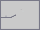
Episode 1 Level 3: spiffy kosher
Hover over the thumbnail for a full-size version.
| Author | The_Mingler |
|---|---|
| Tags | action author:the_mingler episode1 gauss hard skill unrated |
| Created | 2010-11-12 |
| Last Modified | 2010-11-12 |
| Rating | 4 more votes required for a rating. |
| Map Data | |
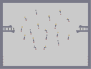
| Description | Longer tunnels are harder on difficulty.
Please RCE. Good luck! :D P.S.: Neat for AGDs! •Episode 1 [nmaps.net] •Level 0: our people marched blindly towards fate [nmaps.net] •Level 1: hidden consequences [nmaps.net] •Level 2: 'm A different machine [nmaps.net] •Level 4: polypsychic [nmaps.net] |
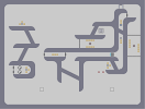
Other maps by this author
 |
 |
 |
 |
 |
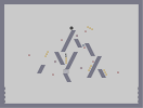 |
| Episode 0 Level 2: boring machines disturbs sleep | Episode 0 Level 3: accidents will happen | Episode 0 Level 4: paranoias | Episode 1 Level 0: our people marched blindly towards fate | Episode 1 Level 1: hidden consequences | Episode 1 Level 2: 'm A different machine |
Comments
Pages: (0)

2012-08-24
and please,
use the last map to put the new banners, don't mind about it, I'll go to delist that map in a few days.. ;)
2012-08-24
wow!!! That's impressive. Many thanks!!!
I can made one more request please?
You can gather some more the title and authors line, not as separate, and then all the cosets lower it a bit at the bottom little lower, on the first one?
And in the second one, you can put the first N'font that I like, do the same with the correlation between the text lines and its position like above, and add the following text line: 'Director's Cut' , like the banner for the rejected maps of the pack, you can?
please, please, please, please!!!! :P
THANKS!!!
2012-08-24
Ok, then,
I have a mission for you. You like missions?
You have been selected from the masses and from all the Gods of photoshop to be the lucky one to do the banner of my next mappack. I like your style, and I want something amazing. Of course I will give credit to you for this in the mappack thread.
The banner size must be 573 x 176 pixels (7,958 x 2,444 inches) on 72 pixels/inch as Resolution (like the others banners on my profile)
I give you the picture, since it is vertical rectangular, and the size of the banner is different, horizontal rectangular, you can do whatever you want, cut, paste, mosaic, be creative and do something interesting.
The mappack title is 'MOSS' and the authors are 'zoasBE' and 'deep_blue', equally, should give equal importance to both.
I like the font you use, and I'm anxious to see what you are capable of.
A big thank you in advance. If you have any questions, contact me.
the image [upload.wikimedia.org]

2010-11-12
Spiffy. Rock that ponytail. :3
:3

2010-11-12
4,5/5 rounded up
AGD is really funny to get. Left-bottom tunnel is decent.
AGD:
AGD:
| Demo Data |
|---|
zoasBE
hahahahaha! LOL, my bad, sorry.
On the first one (this one with the pixel font), you take the 'MOSS' text line and you joint it a little to the 'a mossy adventure by zoasBE and deep_blue' text line. Then, you take the full set of both text lines, and you put it a little lower down.
On the second one, you can replace the font to the pixel font like the first banner, and do the same thing with the text lines (they are basically in the same place as the other banner) Also add 'Director's Cut' somewhere, and harmony together. This is the banner for a possible mappack, with maps rejected.
I want to apologize to my anxiety, and my bad writing. THAAAAAAANKS!!!!!!!