


New York
Hover over the thumbnail for a full-size version.
| Author | Supah-N |
|---|---|
| Tags | author:supah-n n-art nart nonplayable rated sick-nasty |
| Created | 2008-03-28 |
| Last Modified | 2008-03-28 |
| Rating |
3 by 7 people.
|
| Map Data | |
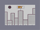
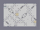
| Description | buildings in new york
i like how it turned out sun is sloppy i know i fixed it thx to the ppl that commented it |
Other maps by this author
 |
 |
 |
 |
 |
 |
| Turret | No Floor | Pac-Man | Abstract | Broken Chain | Can You Survive |
Comments
Pages: (0)

2008-03-28
I have to be critical here, sorry....
It's not that great. By N-art standards, it's shockingly simple. Straight lines and z-snap together in the same art generally makes for bad art. Overall, its just bland. But I wont criticize without giving tips.
-learn to better use color.
-Make z-snap lines straighter and more concise.
-Complexify your N-arts. Add shading, patterns, or whatever you want.
-Dont use bounceblocks in patterns like that cloud. Just doesn't work :P
-try to make your art less linear
-Heres the hardest one of all...add a certain feeling to your art. I know its abstract, right-brain stuff, but you can do it. This looks too much like it oughtta be in crayon.
NR.

2008-03-28
Black Hole Sun
Best part of the map.
The other stuff is good too. Except for some of the gold. Which pieces, you ask? I will never tell.
Anyways, BHS takes precedence: 5.
The other stuff is good too. Except for some of the gold. Which pieces, you ask? I will never tell.
Anyways, BHS takes precedence: 5.
2008-03-28
I like how you situated the buildings.
Maybe you could have gone for a window effect. That would have really filled out the buildings. Also, the clouds could use work. Not bad though.
Ryzor
Well, its still a bit simple...