


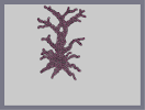
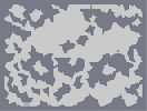
Red dead tree
Hover over the thumbnail for a full-size version.
| Author | Meta_Ing |
|---|---|
| Tags | author:meta_ing n-art tree unrated |
| Created | 2008-10-16 |
| Last Modified | 2008-10-16 |
| Map Data | |
| Description | *I actually submitted this two days ago, but immediately delisted it to work on it a little.
This was actually done quickly. (half an hour) It's my first N-art, and I'm somewhat pleased with it. I think it needs a background but I'll worry about that later when I get better (If I decide to continue N-Arts...) I think it's pretty obvious what this is, but if it isn't, the title should help. Ratings disabled. Not because I expect low ratings, but because I personally don't want ratings for this. |
Other maps by this author
 |
 |
 |
 |
 |
 |
| eiturlyf | This is the title of the map | Training grou... er.. walls... | How to spell "The" | I say "jump," you say: | I say "jump" tileset |
Comments
Pages: (0)


I don't see what you mean by "there's no opportunity for shading or a background..." There's still the option to do those, they just aren't in it right now..
I made it free-hand by the way. Didn't look at any trees or picures of trees.
I made it free-hand by the way. Didn't look at any trees or picures of trees.

2008-10-20
I don't actually like it much
Sure, it's pretty good. But there isn't any opportunity for things like shading or a background which is the real hard wok in a n-art. For all I know, you could have put an outline of a paper tree in front of your monitor and just traced and filled it it.
I hope this will be counted as constructive criticism, and I do want you to make more. I just don't like this very much.
I hope this will be counted as constructive criticism, and I do want you to make more. I just don't like this very much.

2008-10-17
Oh my
it looks quite good even in full screen.

2008-10-17
Quite nice
a little off center, but thats no biggy, i mean its not as if you could move it, i would give it a 4.5 if there were rates

2008-10-16
yea, thats what im trying to say
its like its on a hill, but that makes it look 3d
2008-10-16
Oh
I think I see what you mean now (about how it looks like it's on a slant) If I see what you see, then I did that to try to give it a more 3d-ish perspective.
2008-10-16
i like it in thumbnail best
but i relly like it no matter where it is too! I would agree that a background would be nice, but that takes time. it also looks like its on a slant? whatever, i could never do anything like it, so if i could rate, a 4.5
2008-10-16
*
This, in my opinion, looks slightly better in edit mode, though I wouldn't reccomend trying to load it if you have a less than fast computer.
Riobe
That's a lot o' gauss