


Ghost

Other maps by this author
 |
 |
 |
 |
 |
 |
| SQUID// | Mirrors | We are Hated | moshmoshmosh | Residents | SUNRiSE BATTLESHiP |
Comments
Pages: (0)


2009-08-16
do you
like my maps? i made some new speedruns :)


2009-08-16
Did you know.
That you favourite 1 in every 31 maps? Cos you have that many faves.

2009-08-16
Oh sorry.
I made it look like your maps were bad. They really aren't, don't think this is what I think of all of them, some of them are real gems.
Keep at it and yeah, you'll be real good someday.
Keep at it and yeah, you'll be real good someday.


Well, I agree with every single point you made but I am content with this kind of style I have going to be honest.
I totally understand where you are coming from though and your suggestions would probably enhance the gameplay dramatically.
The bad thing with me though, is that I always focus on aesthetics and how a map looks more than I should and often the gameplay suffers.
Thanks for your feedback anyway. It was really helpful.
2009-08-16
Pfff
Your maps are very good, but they seem put together without any real incentive to strive for new mechanics and gameplay. They all play (and look (sorta)) reasonably the same. That said it looks awesome.
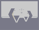
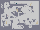
Some problems I have with this map are the gold placement. It stinks, and it's hugely generic. A more branched out placement would work. Then the three one-ways in the bottom. I think it would be cooler without the one on the left and the other two placed a tad higher. And the laser really irks me. The path is stupid and at the start you have to stop and wait a little bit or you get shot. Having one on the outside would provide tension and make it a little more exciting if it was placed so that it could shoot into the two rooms. And the exit would look cooler if it was placed a tiny bit lower.
That said, this map is above average and I think with a little more polish this pack would be really good.

asami
Hey =3