

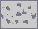
Dangerous 2
Hover over the thumbnail for a full-size version.
| Author | 10010010110 |
|---|---|
| Tags | action author:10010010110 gauss hard skill tricky unrated |
| Created | 2010-05-29 |
| Last Modified | 2010-05-29 |
| Rating | 3 more votes required for a rating. |
| Map Data | |
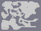
| Description | If you liked Dangerous 1, you will probably like this too. |
Other maps by this author
 |
 |
 |
 |
 |
 |
| Bunker | Random | Jumper | 1230903910410 | Circles | Dangerous |
Comments
Pages: (0)

2010-05-30
I agree with aphex
completely with 2
and only partially with the other 3
sure, be a little less sporadic with the mines/gold, but don't try too much to keep them in certain clusters and all, it often makes maps seem boring and uhh... standard. i guess. I think a better idea is to instead of making them all a similar shape, probably make them of a similar style of placement. Though a mix of both is probably best.
and the rocket section was a littttle plain, but i kinda like it that way.

2010-05-30
quite fun
.
| Demo Data |
|---|

2010-05-29
some helpful tips :)
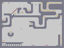
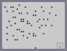
There are some really solid ideas in this map; it is also fun to play, which is really all you need. However, there are a few things that would help change it from good to great. See the image below:
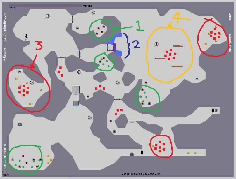
1)The mines, as highlighted by green circles, are not consistent in layout. This can be mended simply by choosing a mine style and repeating it wherever you want to place mines. For example, I would place the mines as shown by the small green circles.
2)Having multiple doors looks a litle ugly. If you made some tile changes (see the shaded light blue part) then you could make the door placement better in terms of looks (for example where I've placed the purple line)
3)As with mines, the gold placement could be made prettier. In the case of the gold which is in the cave just beneath the ninja's start position the gold placement effects the gameplay: it feels random, with no clear sense of how to collect it. If all the gold in the map was put in a nice little clusters that are of same/similar shape, the map would be improved immensely (see the little red squares for an example)
4) Finally, the rocket section feels a little plain. Maybe adding in some extra, not necessary to collect, gold with some one ways would make it better. (this is just a small problem though; really that section is alright as it is)
so there you go. I hope that was helpful :)
I look forward to seeing your next map; try and implement some of those ideas :D
fingersonthefrets
also