


America, This is You.
Other maps by this author
 |
 |
 |
 |
 |
 |
| 21|12 | Mario! | Sim. Chall. | Decile | Half Pie: 21 Below | Different Perspectives, Same Matter. |
Comments
Pages: (0)


2009-05-03
Could it be
Any more simple?
2009-05-03
Well you see
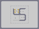
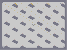
The shape was meant to be a symbol.
If you look extremely closely, you will see uS (Short for United States, if you were wondering).
This can be formed By moving the lower left Part (Made of Bounce Blocks in this case) to the right a notch, to overlap the end of the lower right Part.
If you look extremely closely, you will see uS (Short for United States, if you were wondering).
This can be formed By moving the lower left Part (Made of Bounce Blocks in this case) to the right a notch, to overlap the end of the lower right Part.

2009-05-03
POWERPARAGRAPH
first off, the aesthetics aren't very great...and whats with the nazi symbols
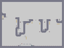
and then i kept going outside the little one ways, so that wasn't fun at all...i never actually finished the map because of this..
thirdly, the three rockets get repetative and lame after the first round around
the playablity isnt that great because of the limited movement, and the flow isn't great either, i had to go around twice to nab all the gold...
WHY DOES IT LOOK SO BAD!!!
overall, i would say a below average map, most people could do better, including you
2009-05-03
Well you see,
I addressed America, and then made a comment. Sorry, do you feel left out or something?
2009-05-03
keninja
POWER PARAGRAPH