


Organized Rhyme
Hover over the thumbnail for a full-size version.
| Author | Meta_Ing |
|---|---|
| Tags | author:meta_ing metanet-esque unrated |
| Created | 2008-07-16 |
| Last Modified | 2008-07-16 |
| Rating | 1 more votes required for a rating. |
| Map Data | |
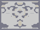
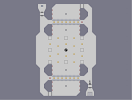
| Description | Eighteenth level in the Metanet-esque series. The other seventeen can be found here [nmaps.net]
I am open to any ideas and/or suggestions regarding this or future levels. This level features a "not-too-simple, but not-too-complex" tileset consisting of only 'E' and '1' tiles. You can choose to speedrun this, or highscore it, whichever you prefer. --- Edits: Made a slight modification to the tileset, for ease of flow. Four mines on edges removed. |
Other maps by this author
 |
 |
 |
|||
| Sweep | Laser wall | Giant Man-eating iPod Nano | Black holes | Nario bros. | Hang |
Comments
Pages: (0)

2008-07-16
IMO
there's too much gold. As the map's symmetrical the repetition of it gets dull when attempting an agd. Just because there is space doesn't mean it has to be filled.
Good fix removing the mines, they really disrupted play more than anything.
Good fix removing the mines, they really disrupted play more than anything.

2008-07-16
One other thing
Could you let me know which gold you are talking about particularly?

2008-07-16
Well,
removed would be better, in my opinion:)
Else then that, I like it, and AGD-ing is fun
4/5
Else then that, I like it, and AGD-ing is fun
4/5
2008-07-16
ATOB
Which parts would you say are the least flowy in your opinion. (Oh, and I assure you, I tried to make the gameplay fit in with the design)
Also, (to anyone), let me know if you think I should remove the four mines on the walls by the launchpads (you should know what I'm talking about). I originally intended for them to slow you down from getting the switches, but now I think they are nothing more than a hinderance.
Also, (to anyone), let me know if you think I should remove the four mines on the walls by the launchpads (you should know what I'm talking about). I originally intended for them to slow you down from getting the switches, but now I think they are nothing more than a hinderance.
2008-07-16
Yes I did...
By "first jump," you mean the ones out of the bottom and into the areas where the rockets are right?
2008-07-16
Looks like it should flow
a lot more than it actually does.
It's almost like you built this entirely to make it look a certain way with gameplay as an afterthought. Feels like it's a few revisions away from a fun and intuitive map, as it is the design leads to a very 'trial and error' style of play, frustrating.
Also, most of the gold seems completely superficial, there's not much incentive to snatch it all.

2008-07-16
Pretty good
Don't like the first jump though. 3.5/5 rounded up.
astheoceansblue
As for general flow issues
The bottom gold room and the middle section below the two lasers being the main offenders.