

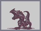
Dragon After Dusk (step two)
Other maps by this author
 |
 |
 |
 |
 |
 |
| Baby Dragon (step one) | Baby Dragon (step two) | Baby Dragon (step three) | Why is the moon so far away. | Baby Dragon (step four) | Dragon After Dusk (step one) |
Comments
Pages: (0)

2008-12-30
I like the blue
but you should really try to make something else. How about a shark?

2008-12-30
f'n a!
I was the turkey all along


2008-12-30
good, I can't wait for the next one, but
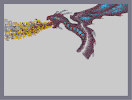
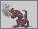
the fire color order is a little off ie-there is a little blue towards the edges, while blue flame is usually closer to the mouth, as it is hotter than red flame
I like the black in the fire, and the blue in the wings, and I'll probably fave the next one because it is looking good
I like the black in the fire, and the blue in the wings, and I'll probably fave the next one because it is looking good

2008-12-30
great stuff
one of the best n-arts ive seen in a long time. Im not going to rate till it's done though.

2008-12-29
Also
I see where eganic's going and agree to an extent considering the context, but imo ninjas should have been used rather than one ways? Then again, I've never made an n-art

2008-12-29
You really should
try something other than Dragons...

2008-12-29
baby dragon is soooo much better
this does have potential

2008-12-29
I'll try to
smooth it out.

2008-12-29
I agree about the submissions
But I think that more fire and less smoke is better here because the dragon's (eventually going to be) bigger. Therefore, it should breathe out more fire.
2008-12-29
Ok the next version will
be the finished product.

2008-12-29
chunky
the fire in this one looks 'fake and chunky'
i meant to put that in the before comment.
i meant to put that in the before comment.
2008-12-29
@GTm
i disagree, i think the fire in the baby dragon one looks better because its premature fire. its more like smoke, really. whereas this one looks very fake.
i would appreciate if you would stop posting part of the narts because it takes up space and all i want to see and judge is the finished design. if you submit that, then want to add more to it, go ahead, but please dont keep submitting *parts* of the narts. its obnoxious.
i would appreciate if you would stop posting part of the narts because it takes up space and all i want to see and judge is the finished design. if you submit that, then want to add more to it, go ahead, but please dont keep submitting *parts* of the narts. its obnoxious.
2008-12-29
Agreed with GTM
.
2008-12-29
His eye looks kinda funny.
I'll fix that later.
2008-12-29
Fire looks better
than the baby dragon

2008-12-29
If I could rate

2008-12-29
doesnt
look as good as the baby dragon yet.
but keep working on it.
but keep working on it.
2008-12-29
better
but still I don't like where it's going.
Nice colors though.
3
Nice colors though.
3
ganteka
you really should finish this