


Metabolism
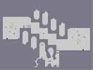
Hover over the thumbnail for a full-size version.
| Author | SundayMorningCall |
|---|---|
| Tags | action author:sundaymorningcall rated |
| Created | 2009-10-02 |
| Last Modified | 2009-10-02 |
| Rating |
2 by 21 people.
|
| Map Data | |
| Description | I love this map. I may include it in my map pack. |
Other maps by this author
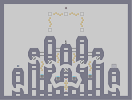 |
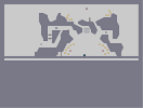 |
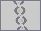 |
| Capital City | A beautiful sunset | Oval Looprings |
Comments
Pages: (0)

I liked the tiles in the exit-switch area.
The gold was nice and the gausses didn't bother me as long as I kept moving. Which imo is fine.
I didn't really like the middle section though. It felt like it had little purpose
ratatat_: I think it's a little rude to just assume someone made a map "just for looks"
chume: I personally think rotational symmetry would not have worked with this map at all.
While I agree that there isn't really anything new, I don't think this is a bad map.
Now, if I could only pull off that corner jump:
| Demo Data |
|---|

2009-10-03
Hey I like it too.
I'm not sure why everyone's shitting on it. I mean, it's not fantastic, but it's not "below average"

2009-10-03
Yeah.
Well I liked this map.

2009-10-03
I support chume
and I have a few more things to say.
This map was made entirely for looks. It has no decent game play in my opinion, and feels awkward. I am not a substandard N player, I consistently place decent demos on many maps.
Your style can produce good maps, but play testing and attention to detail is needed.
You give out criticism with every comment you make, but you cannot accept any advice. How could you not love this map, you are the maker. Everyone who submits feels like they should get a good rating.
There is no rationale behind your arguments. You give no constructive feedback. Your attitude is that of a spoiled kid who wants attention. every account you make is an attempt to get the attention you feel you deserve, but your nature is revealed almost immediately. Sycamore is a prime example. You need someone to wake you up.
Change your attitude.

2009-10-03
chume is very good
better than you, i'd say

2009-10-02
oh wow. you're actually a jerk!
hadn't realised.

2009-10-02
eh
Basic, felt generic.
Also, why are you such a prick to everyone? You're taking yourself, and numa way too seriously. Chill out.
Also, why are you such a prick to everyone? You're taking yourself, and numa way too seriously. Chill out.

2009-10-02
I...
Don't care?

2009-10-02
my critique
evaluates the quality of a map against both the numa average and the expected output of the individual. It then proceeds to give reasons why this is my personal opinion on the map.
The enemies do pose no threat I agd'd this map first attempt and didn't really have to change my path at all to avoid the terribly ineffective and ugly gauss floor-guard combo, it didn't even have rotational symmetry).
the tile theme is common used better in all these cases and many many more
http://www.nmaps.net/149376
http://www.nmaps.net/94621
http://www.nmaps.net/175545
http://www.nmaps.net/146886
http://www.nmaps.net/146890
http://www.nmaps.net/182225
The jumps getting to the exit key were awkward if you can't see this then I can't show it to you just play the map and it's mind-numbingly obvious it feels like you haven't even play-tested this part of the map you just put it in cause it fitted with the tiles.
This contrasts with your critique which commonly goes along the lines of as fbf said "our maps suck....make them better" possibly including some uninspired and irrelevant insult to the person in questions intelligence, a jab at their spelling ability and some much needed praise of yourself.
There's nothing in anyway inventive about this map no new mechanics no clever object use or complex multi-route management of space, there is nothing and calling your own action map a work of art as a defence of it's flaws is one of the most pathetically conceited things I've ever heard.
Over all I never give biased critique and I've never been against you until now. I've given moderated praise to your better maps like that recent dna one and the first one you made on this account. While telling you why others such as this and the cross one are not up to your ability. Its obvious however that for all you can dish it out you can't take it and for all you "I really don't care" bravado you fundamentally insecure and require the validation of your own immense ego above all things. I've never particularly disliked you up to this point but I am now your enemy as are most of this community.

2009-10-02
Actually
chume makes very cool maps. While often unpolished, his maps are full of innovations and neat mechanics.
The tiles are attractive, but the objects are more than uninspired.
The tiles are attractive, but the objects are more than uninspired.

I really liked the tiles, the gameplay held some nice challenges, even though it was cramped for speedrunners, but it isn't quite 5 material. The rating you got is what you deserved for this map, imho.
Also, don't be rude to the people who play your maps, just deal with their comments in a mature way, no need to bash.
Also, don't be rude to the people who play your maps, just deal with their comments in a mature way, no need to bash.
| Demo Data |
|---|
2009-10-02
Ugh
I hate it when people who's maps suck give me critique. They know hardly anything, yet they act like they've been here for years. If you don't know shit don't say shit. Common theme? Common bloody theme? This isn't common. It's new and inventive, and a work of art in my opinion. I do agree there is something missing though, but chume, your critique is absolute bollocks. Biased, as are most of the community.


2009-10-02
I didnt say
it dude chill

its just.. there was something missing. im afraid i can;t elaborate. maybe if you had made some gold challenge in the other unused chamber bits. nice tiles.
| Demo Data |
|---|
is it just me, or did he take some elements (tiles) from this map: http://www.nmaps.net/182225 [nmaps.net]

2009-10-02
bad for you
None of the enemies presented any challenge. Tiles were a ugly variation on a common theme and getting the exit-key was tedious getting worse the more you played the map. Maybe there was a little bit of atmosphere but not much and it wasn't well used.
| Demo Data |
|---|
2009-10-02
and for the record
my maps are made for the playablilty, not for looks not to impress people but to help make people enjoy their experience of playing my maps. Looks are considered but gameplay wont be sacraficed for it. So if you have some good feed-back Im all ears...otherwise keep your comments to yourself please.

2009-10-02
yeah.
i agree completely 100% with fbf. you tell me i need to make better maps, yet i dont know what wrong with them??????
2009-10-02
your advise
seems to consist of "your maps suck....make them better"
I need real advice like "in this map I would have done this because of this" So if your going to give me advice make it good advice.
I need real advice like "in this map I would have done this because of this" So if your going to give me advice make it good advice.
2009-10-02
really nice tiles
really useable....
wish you had used them better..
wish you had used them better..
2009-10-02
very cool
atmosphere wasn't really there for me

2009-10-02
first try agd
definetely has atmosphere. love the tiles. gameplay on the left hand side is my favorite. 4/5
| Demo Data |
|---|
2009-10-02
AGD
Hopefully this has atmosphere.
| Demo Data |
|---|
StoneySmile
Chume's Critique